Introduction

This is DigiTree's blog. The blog that contains the art projects that I've done and it's joy and sorrow... Take a look around. Don't hesitate to leave a comment.

Sunday, April 5, 2009

ArtChipelago Indinesia!


One of the ArtChipelago’s project, India mixed Indonesia. I made some illustration for it, using the story of Dropadi, woman who married the Pandawa 5. The original story, Mahabaratha came from India. And it blended with the Indonesia culture when the foreign trader came to Indonesia.
I mixed the pattern of those two country. One is ‘batik’, from Indonesia, and the other is ‘parsley’, from India. The woman in the middle is Dropadi (in my imagination). The color of her copped skin, type of face, and the red mark in her forehead show that she is an Indian. I think exotic is the characteristic of India. The woman, the culture, the legend, all of it. So I chose a colors that can express to it.

The other illustration are Dropadi, with her 5 husbands. Dropadi is a very beautiful woman, attracting with a very high sex appeal. The polyandry she did with Yudhistira, Bima, Arjuna, Nakula and Sadewa is a part of Mahabaratha story. Their hands are blue, for stabilized the red color of Dropadi’s hair (which known as a princess of fire), also because after the Pandawa 5 died, they became a goddess, which often described has blue skin.
The media is pencil color, in an A4 drawing paper. 100% handmade. The references I’ve got are from Wikipedia, or other site I’ve searched in Google and some books.
Tuesday, November 25, 2008

Surrealism Photography


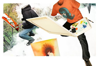
My digital photography assignment…was a montage. Thanks to the angel who saved my life(yes, I live around the angels), Andi for borrowing me his camera :D Well. This is ‘Seniman dari Mimpi’. Simple concept, just about creativity(though I made a very long essay about it…lol). I made the ‘invisible man’ and the model(waw) are Andi and Unang (thanks to you two!).
The idea came when they were having a painting minor class. So they don't have to pose for it(except Unang who has a very high awareness of the camera). The backgrounds are a mixing landscape of trees and clouds, editing in Photoshop, captured by a pocket camera last year.
So if you had addlebrained, open your eyes and look around you. There are many things that you never recognize are very extracting and possible to give you inspirations.

Sunday, November 16, 2008

still life photography


Digital Photography always makes me panic... 1.because I don't have a digital camera 2.because I'm very inexpert in taking a picture -_-;
The fifth project in my class was a still life monochrome-black and white photo. I fell asleep and passed the class (as usual), so I didn't know what the task was about until the next day. I had 2days to give the photos for ACC. ops... I won't make it.
So I opened my last year photo files on my computer, and edited it in Photoshop into black and white. The picture above is from my project in fourth semester, took with AE1 Canon analog camera, while the other one was taking with pocket camera...
If you didn't have enough time for your project, open your own work files and look if it can be used for the new project. Don't ever crossed in your mind to use somebody else work except for montage :P 

Saturday, November 1, 2008

Best Songs When Rain...


Choose. CD packaging or Chocolate packaging?
CD, of course, mam...,said I

This project was a hell(hell yes I always said that). I thought I wasn't gonna make it on time. But thanks to my friends, Cheta and Dhejih, GOD sent them to my house on Tuesday to help me...;D
This is an easy listening compilation, BEST SONGS WHEN RAIN. A compilation that really nice to be heard when rain comes. Contains 4cds: oldies, now, asian, and instrument. Target markets are teenagers and old people.


I bought a new umbrella, cut the stem with an insult... stabbed it onto the box...simply just because I used the rain theme, and it makes it easier to be carried…
I used black linen, carton, artpaper, transparent sticker, silver paper, and of course, the umbrella stem :P

Monday, September 22, 2008

Re-Package it !


The question is ‘Do you like sunflower seed?’. 

Nope, let’s change the question...’Do you ever eat sunflower seed?’. Many people doesn’t even know what is that…(I’m hyperbolized it, of course). Sunflower seed is delicious. But most people will buy it because they already like it. They just see the sunflower seeds, not the packaging (sure, they don’t eat the packaging). But guess what? Packaging is like an SPG, beautiful SPG will get many customer. Time to re-design packaging…
TJHIA TJHIA Sunflower seeds is one of the sunflower seeds product. Actually, I already like the packaging (so why I re-packaged it???). The sunflower seeds are big and sweet...but I'm not gonna talking about that. The packaging was a pillow shape with a recycle paper. Though it has too many words (because the nutrition information are in 3 languages), but the layout is nice.


So. This is the re-design... made it from Artpaper with an old paper texture print and red sticker glossy lamination. I had search for it in many where, but I just found it in Angkasa Putra Digital Offset that time. 'Miss...we just have A2 sticker for printing...and it cost Rp70.000,00. with Rp15.000,00 of lamination glossy ...', said the man. I'm broke. I just want A5 and must print it in A2...
Perfect.
On the next day, I went to Print+, which near from my campus to print the concepts, and was shocked... 'Yes, we can print it in A5 sticker paper...', said the woman.
Life is cruel, friend...

New iPod Touch Limited Edition???


It's New iPod Touch Limited Edition! Just my hope... DKV mayor 3 project 2 was making casing design and layout magazine advertising(am I right?Looks like I'm wrong.lol, never mind). I chose iPod Touch's casing, therefore I just have to make the back side of it (yes cheating).
The Theme is DigiTree (again and again). It's technology concept for black casing and natural for red casing. The black one is for men, and the other one is for female.
I used Corel draw 5%, blender 3D 10%, and Photoshop 85%... Context family for fonts and minimized the layout..

Thursday, September 11, 2008

10 Pills of Life


10 Pills of Life was my Final project of Book Design. Because it was a final deadline time for every subject, I did it in rush and it had a lot of mistakes here and there. Well it finished in time by the way…


Actually, I don’t really know what kind of book I made. It’s kind of prescription for heart medicine. I don’t talk about the liver, surely. I share some of my experience in this book. Just a simple way to makes us feel happy. It is how you realize that you are a happy person.


enjoy and be happy :)